
CYN MOSS is a sea moss smoothie brand concept created to merge wellness, flavor, and modern visual appeal into one cohesive experience. The goal of this project was to build a brand that felt fresh, vibrant, and elevated while making a health-focused product more visually engaging and marketable to a wider audience.
For this project, I developed the brand identity, designed the packaging system, and built the website to create a full consumer-facing brand experience from concept to launch-ready visuals.


The first phase of the project focused on developing a visual identity that felt unique to the product.
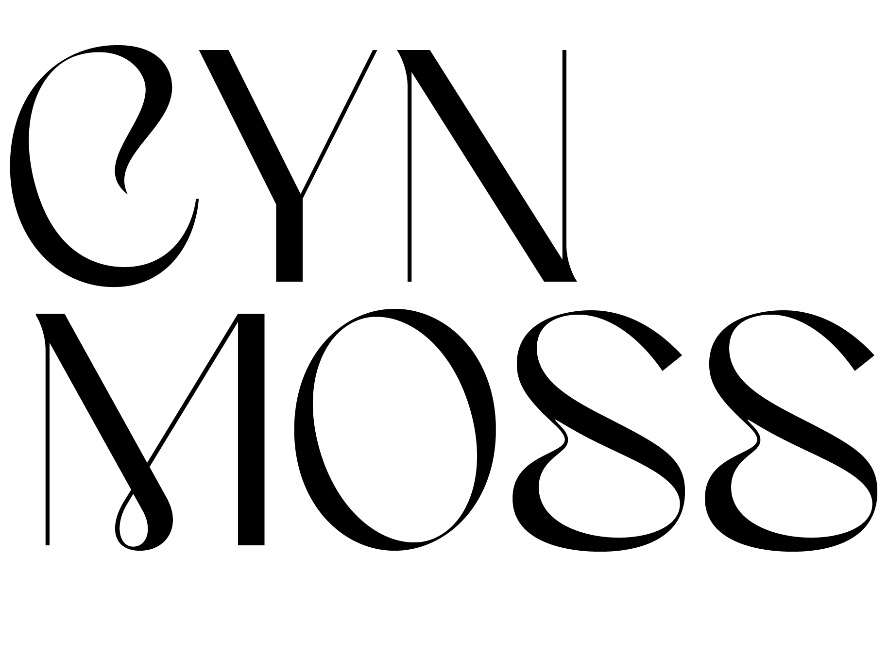
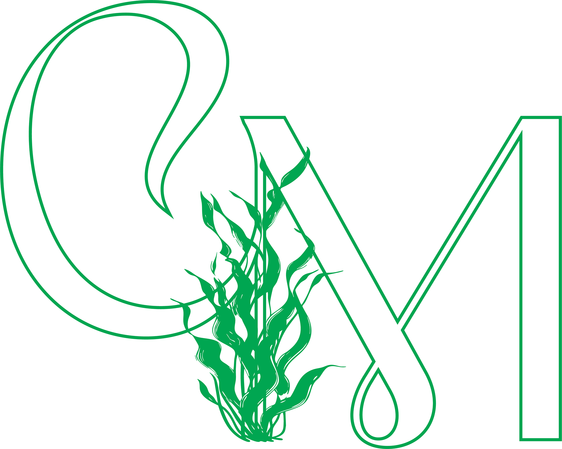
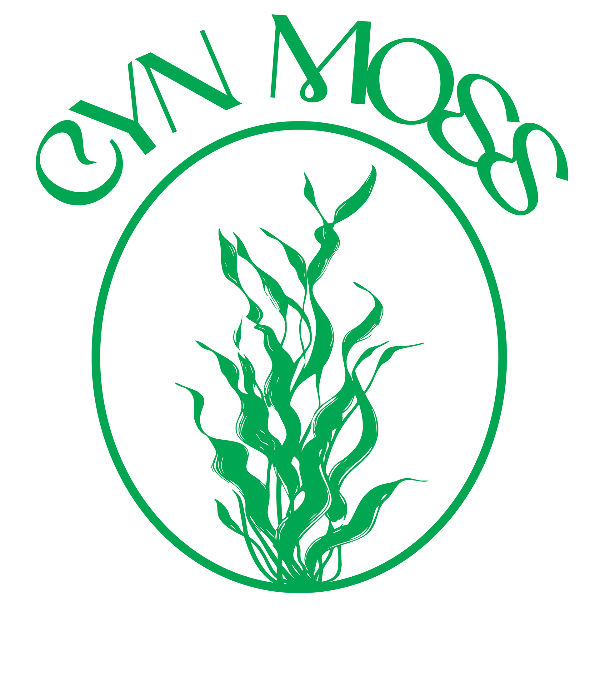
I created a custom word-mark for CYN MOSS with letterforms that feel expressive and organic. The logo was designed to feel bold, memorable, and slightly fluid, which helped reflect the natural, blended quality of the product while still maintaining a modern and polished look.
From there, I established the creative direction for the brand:
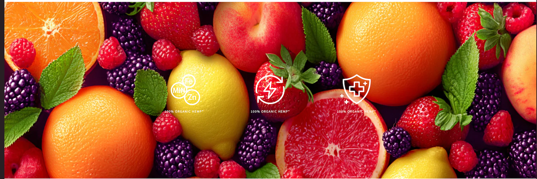
a vibrant fruit-inspired palette
soft neutral tones to balance the intensity
elegant typography choices that support both personality and readability
a clean but visually rich aesthetic that could appeal to a health-conscious audience
The brand identity was designed to feel energetic and fresh without losing structure. I wanted it to feel strong enough for packaging and digital use, but still flexible enough to grow into a larger product line.
Sea moss products are often marketed in ways that feel either too clinical or too generic.
I wanted to create a brand that felt more intentional—something that could sit comfortably between wellness, lifestyle, and beauty-inspired branding.
I wanted to create a brand that felt more intentional—something that could sit comfortably between wellness, lifestyle, and beauty-inspired branding.
The challenge was to design a system that would:
communicate freshness and health benefits
feel visually premium and memorable
support multiple flavors through a scalable packaging approach
translate seamlessly into a digital shopping experience
Because the brand needed to live across both physical and digital touch-points, every part of the design had to feel connected.

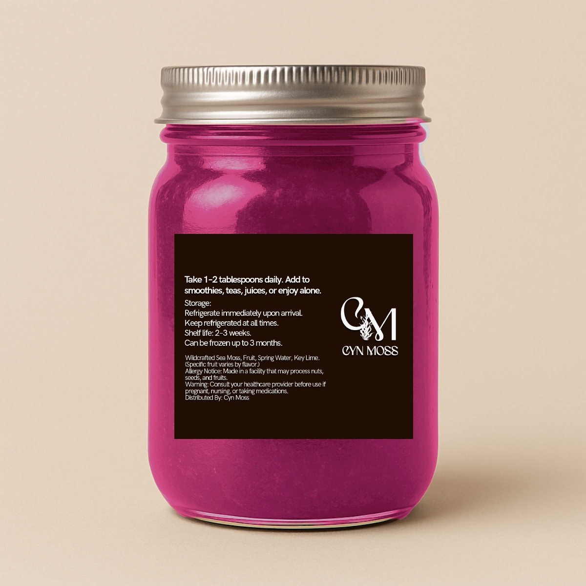
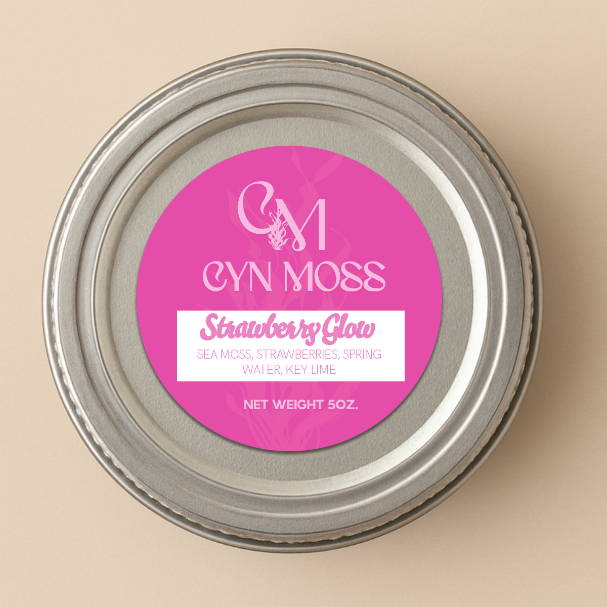
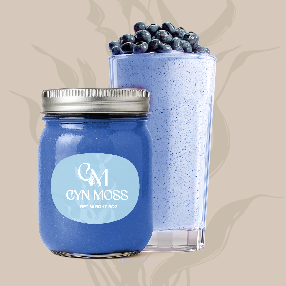
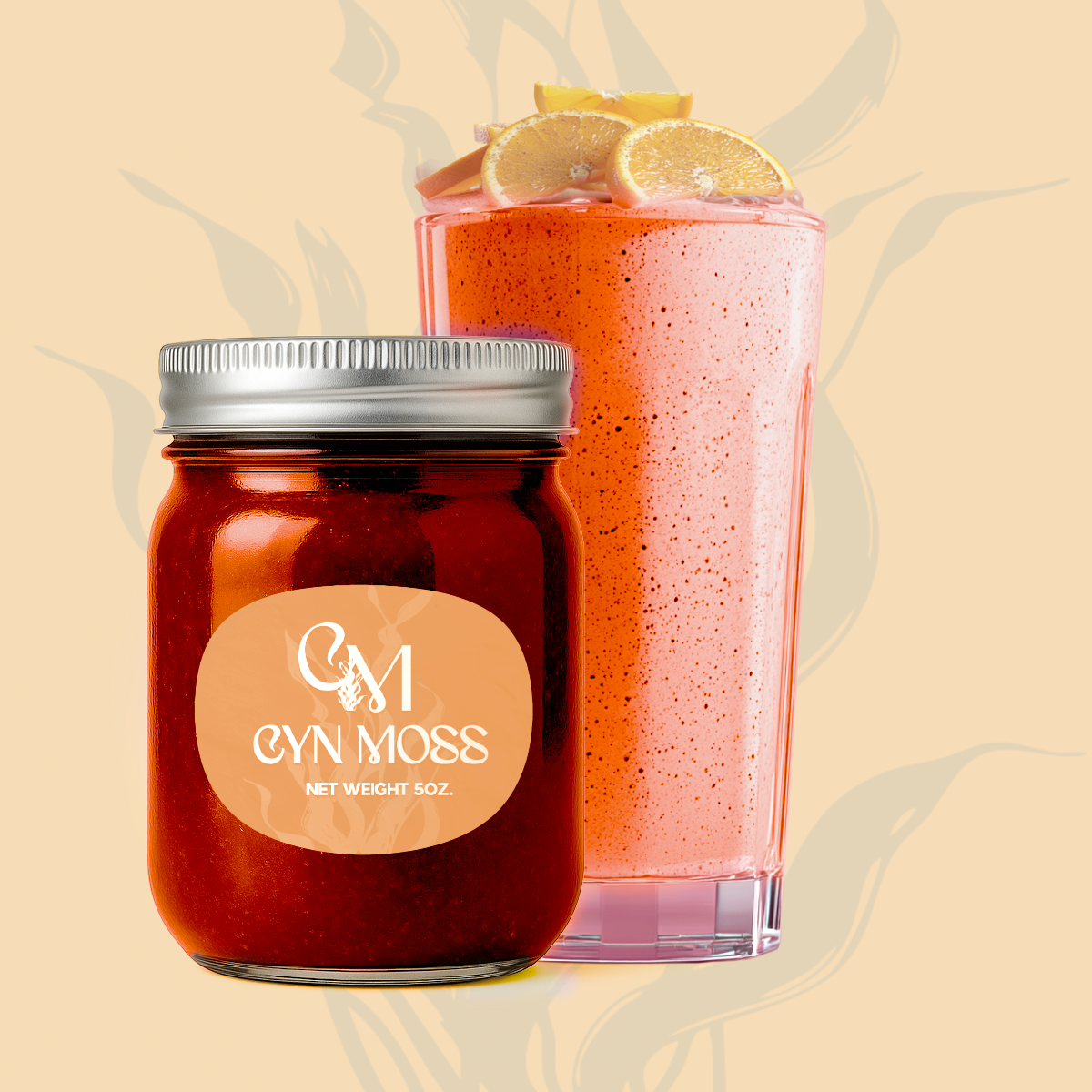
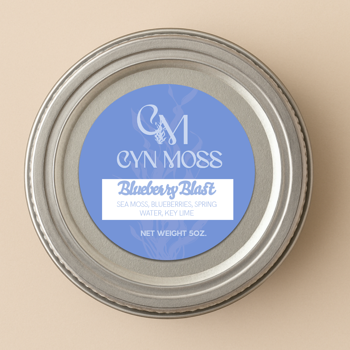
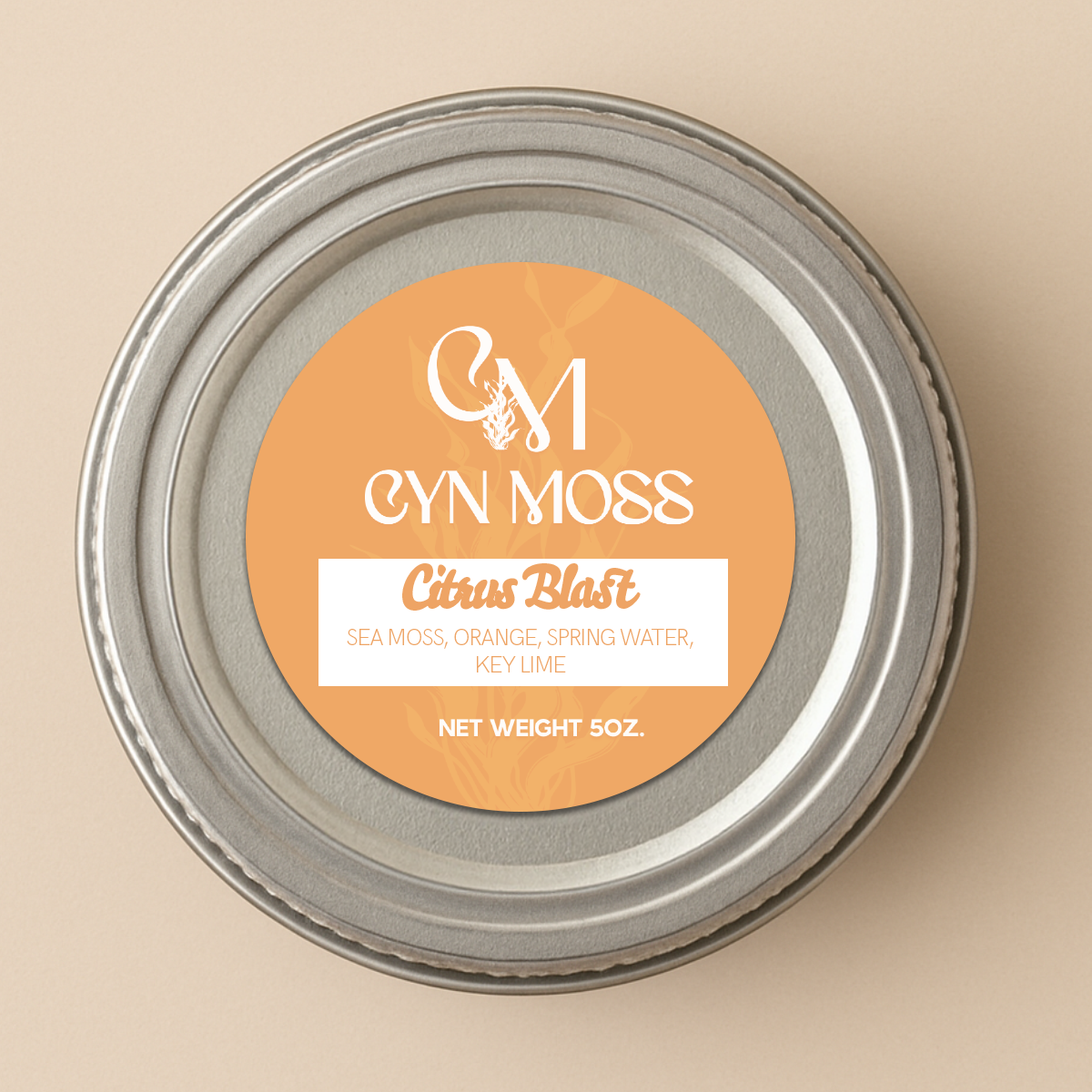
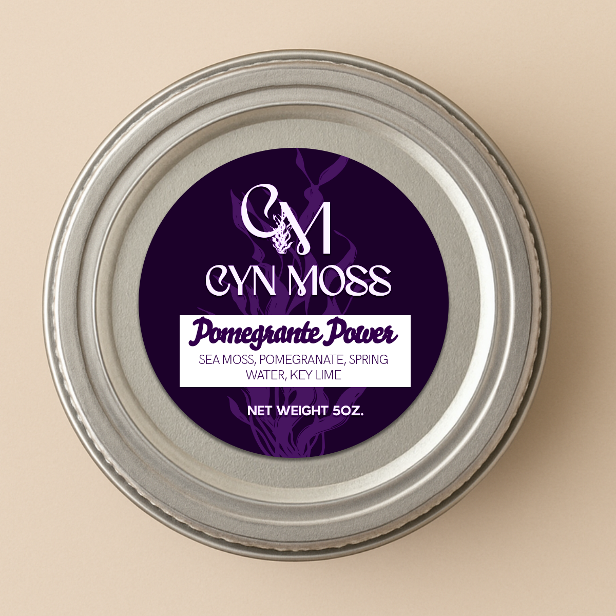
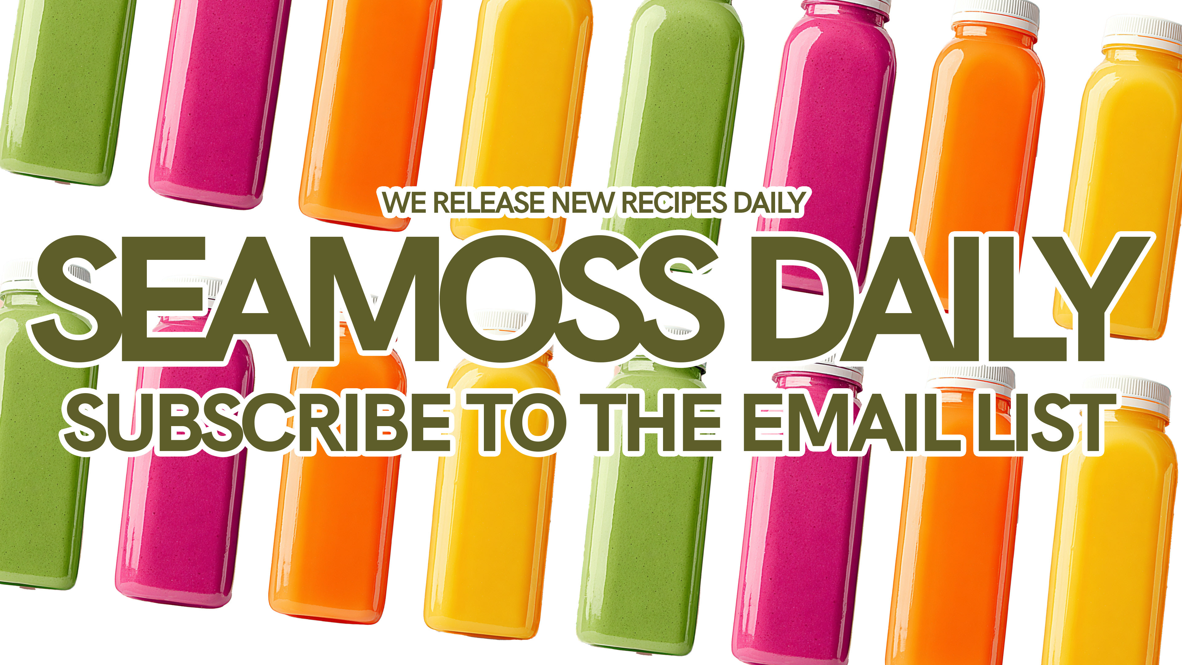
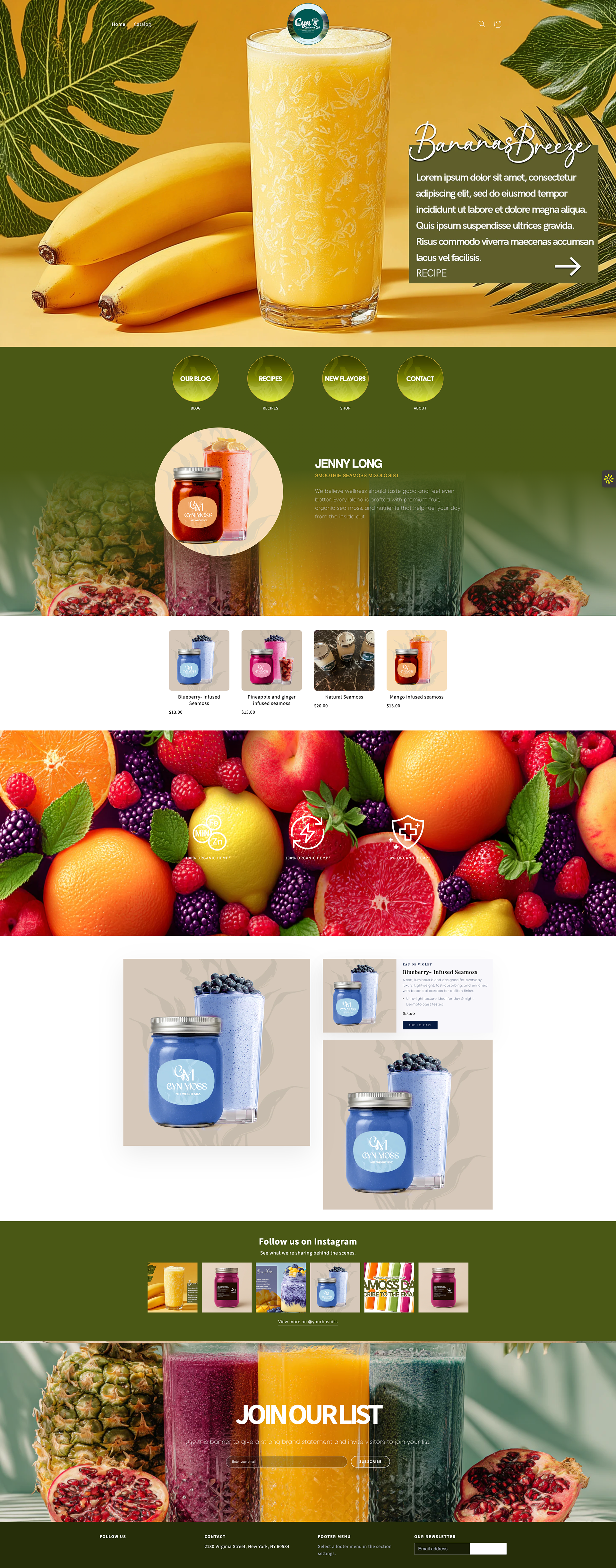
Once the identity was established, I moved into packaging design.
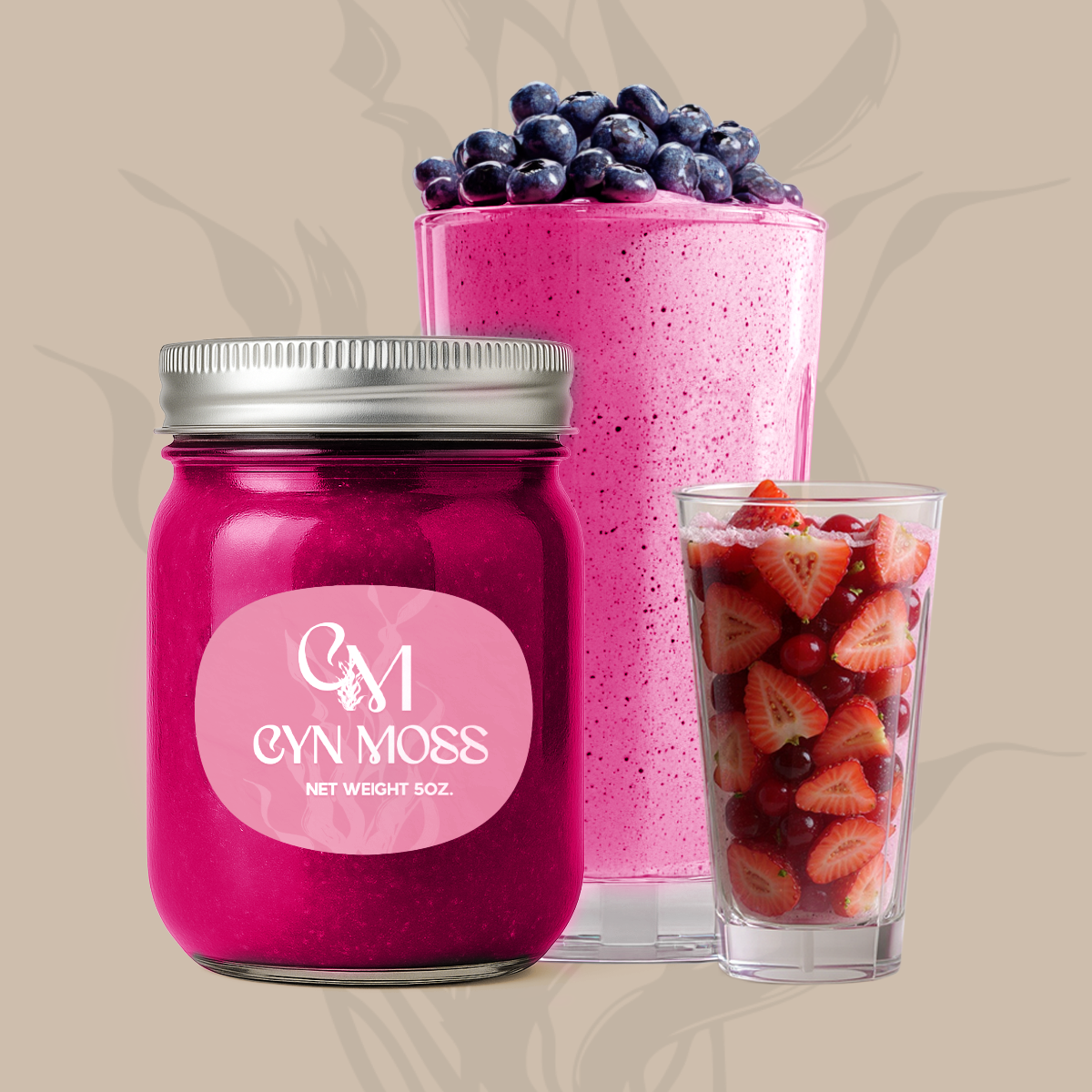
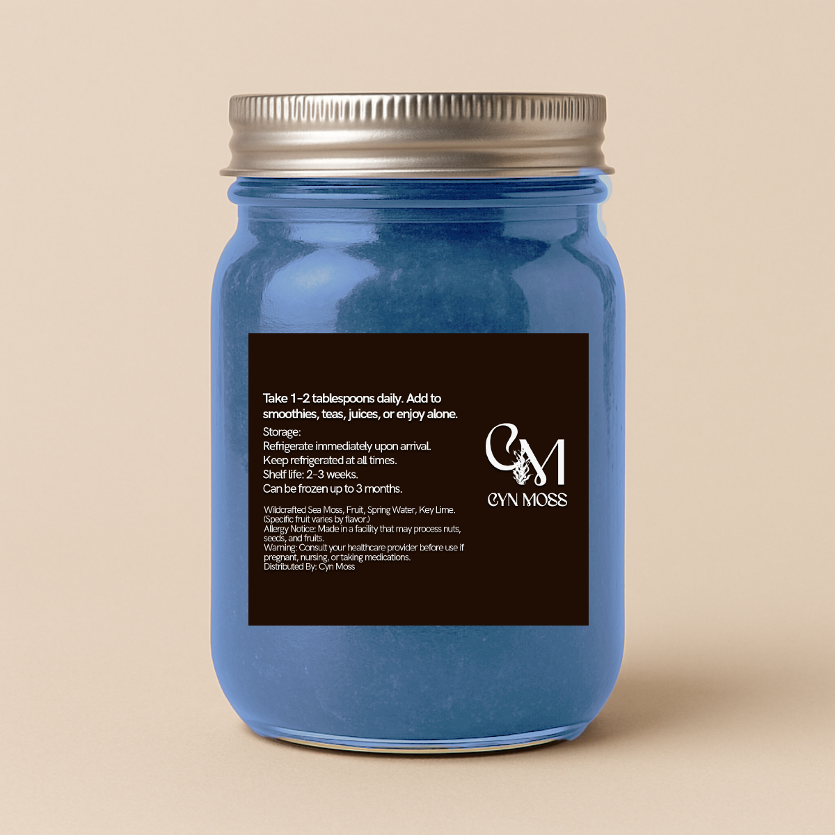
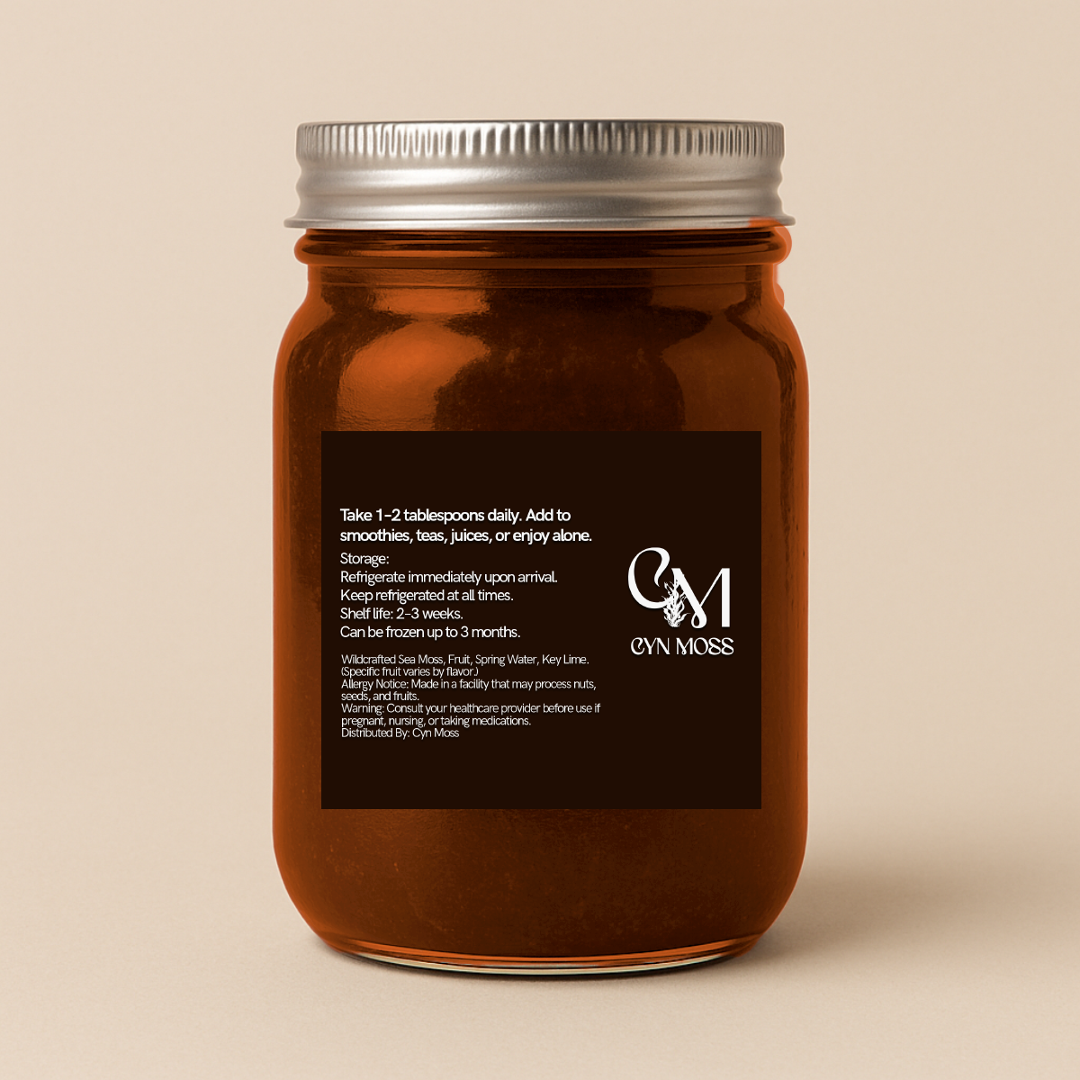
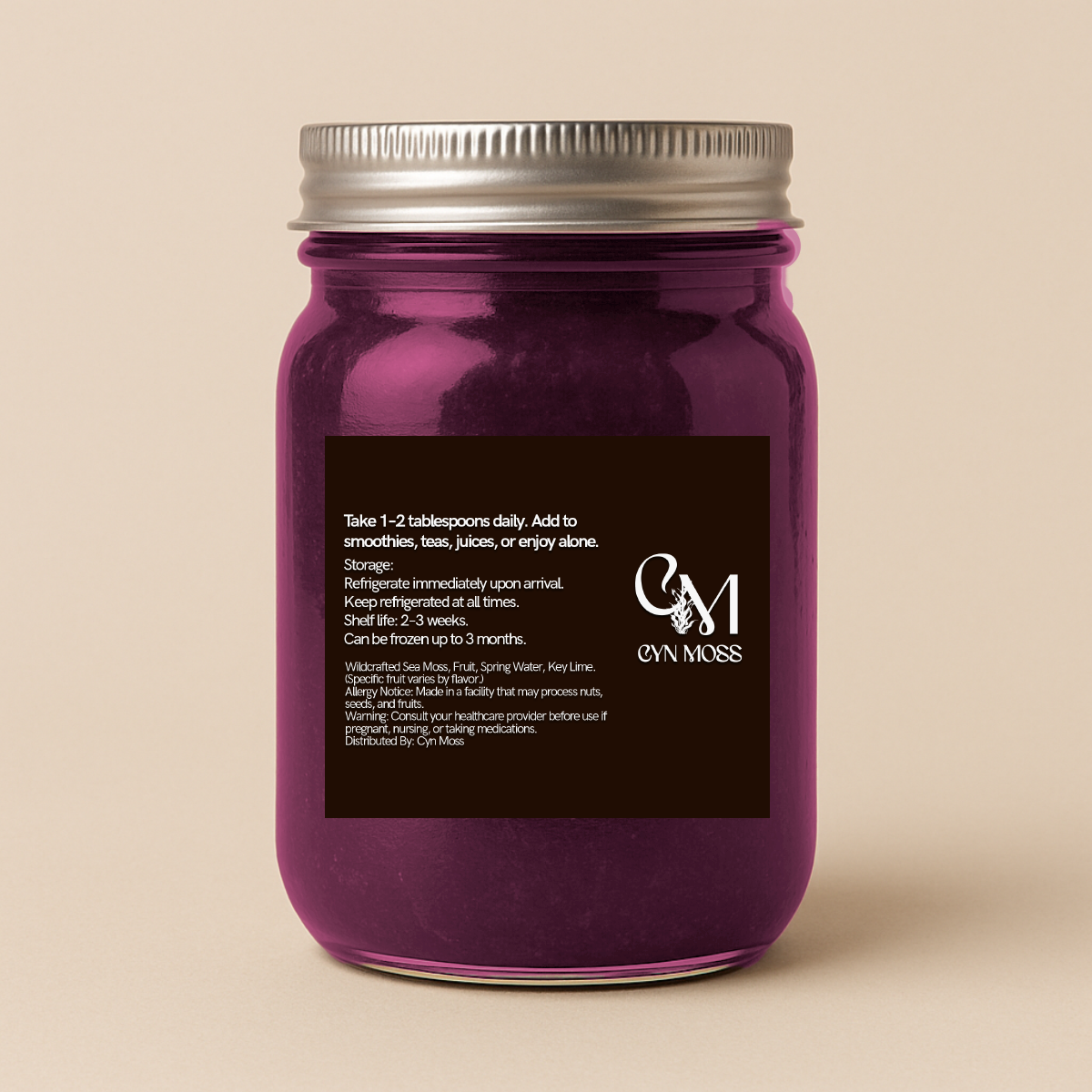
The packaging needed to communicate flavor quickly while keeping the brand visually cohesive. I developed a label system that could work across multiple smoothie variations, using color as a primary way to distinguish each product. This made the collection feel unified while allowing each flavor to have its own presence.
The packaging direction focused on:
creating a clean and recognizable label structure
designing flavor variations that still felt part of the same family
balancing aesthetics with product information
making the jars feel fresh, appetizing, and shelf-ready
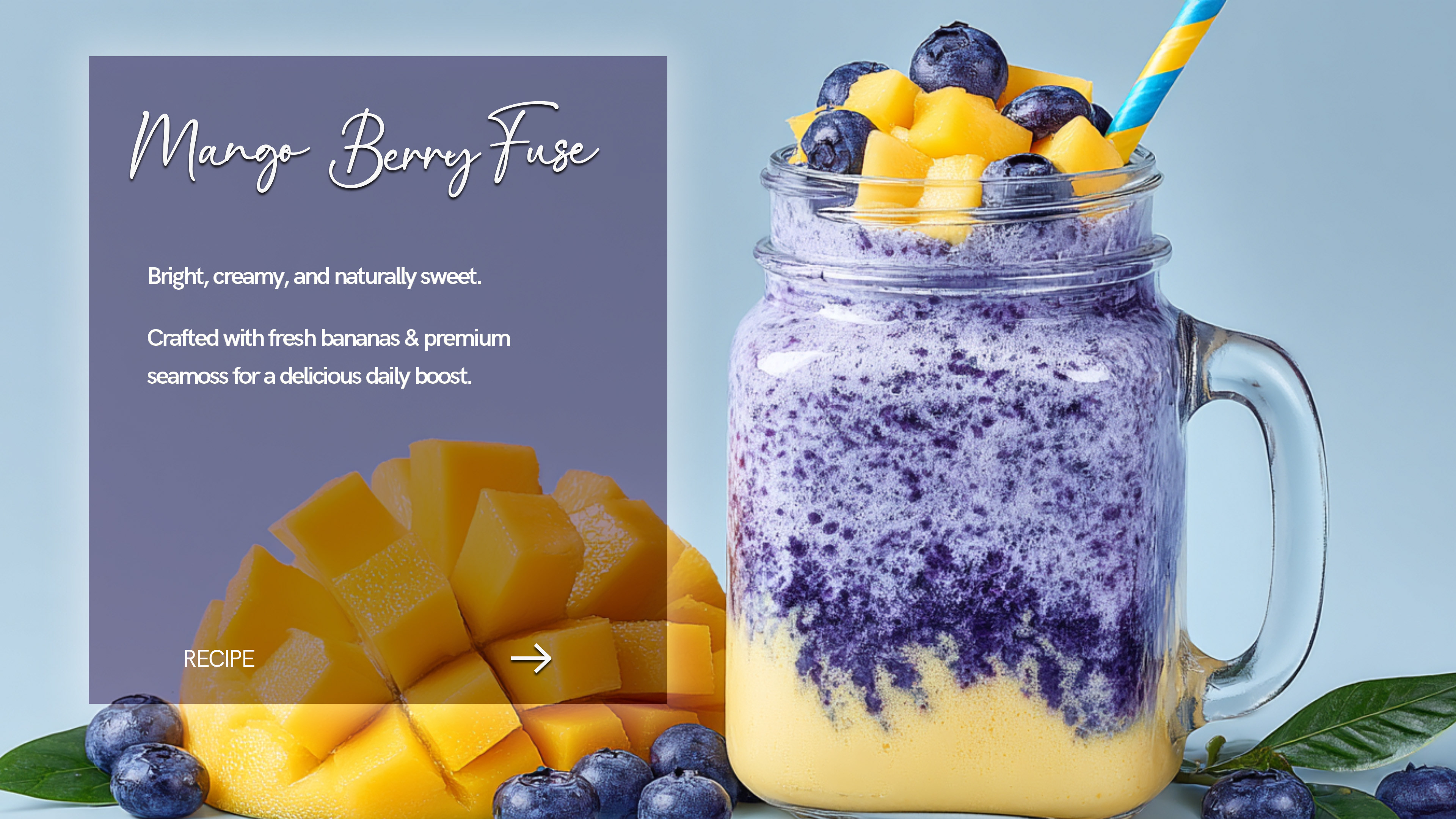
I used realistic mockups to show how the packaging would appear in a real-world setting. This helped bring the concept to life and gave the brand a more complete consumer-facing feel. The mockups also allowed me to test consistency across multiple product SKUs and see how the identity performed in a packaging environment.
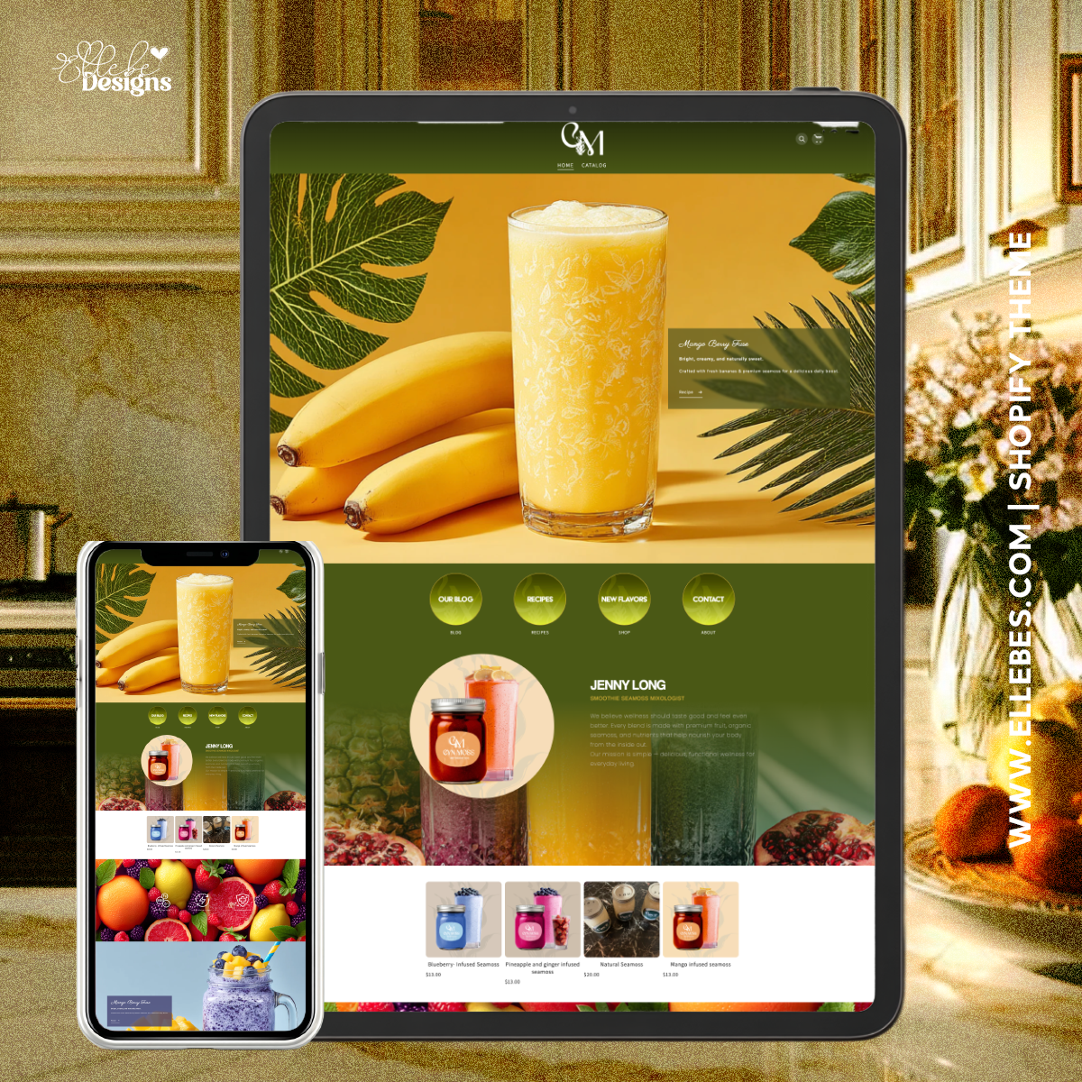
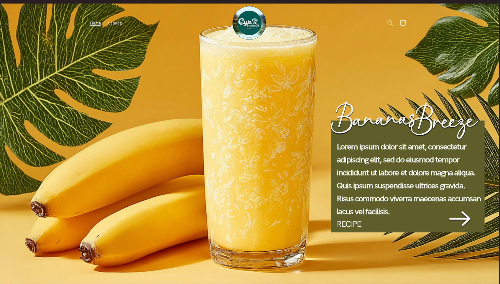
Designing the Website Experience
After the packaging system, I expanded the project into web design and development so the brand could exist as a full e-commerce experience.
I designed and built the website in Shopify, translating the identity into a digital storefront that feels immersive, colorful, and easy to navigate. The website was meant to support both storytelling and shopping, giving the brand a stronger sense of legitimacy and reach.
In building the site, I focused on:
large, visually engaging hero sections
flavor-forward imagery that immediately communicates freshness
product presentation that feels clean and inviting
a layout that supports browsing, discovery, and conversion
a consistent visual language between the website and packaging
Because I coded out the site, this phase was not just about visual design but also execution. I made decisions around layout, structure, and user flow to ensure the online experience matched the energy of the brand itself.
Website:
cyns-moss.myshopify.com
cyns-moss.myshopify.com
The visual direction of CYN MOSS was inspired by freshness, fruit vibrancy, and a tropical-meets-luxury sensibility. I wanted the brand to feel bright and energetic, but still elevated enough to stand apart from more generic health product brands.
The imagery and color choices were used intentionally to reinforce:
freshness
flavor
wellness
premium appeal
This helped the project feel less like a basic smoothie
concept and more like a fully imagined lifestyle brand.
concept and more like a fully imagined lifestyle brand.