
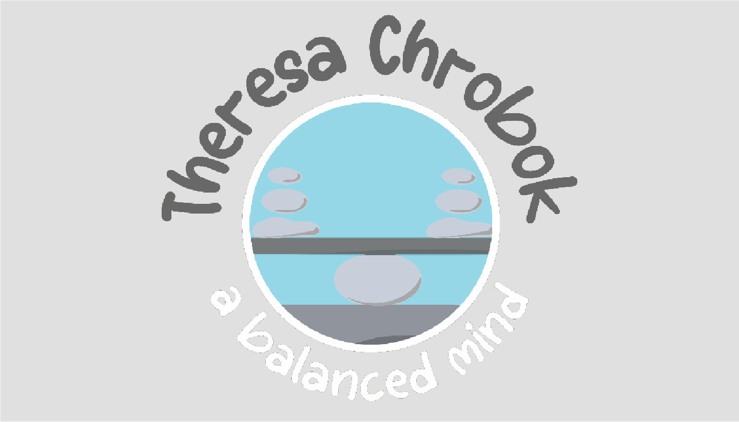
Theresa Chrobok is a seasoned therapist with extensive experience in adult inpatient addiction programs, partial hospitalization, and intensive outpatient settings. Her therapeutic approach emphasizes a balance between empathy, connection, and compassion, with a strong foundation in Dialectical Behavior Therapy (DBT) and Cognitive Behavior Therapy (CBT). The logo should reflect her commitment to creating a safe, calm, and trusting environment for her clients.
Project: Brand Identity
Designer: Eldee Benjamin
Tools Used: Adobe Creative Suite
Deliverable: Brand Guideline
The stationery for Theresa Chrobok should be a seamless extension of her brand, reflecting her professional expertise and the compassionate, calming environment she provides for her clients. Through thoughtful design elements and consistent branding, the stationery will enhance Theresa’s interactions with clients and colleagues, leaving a lasting, positive impression.
A balance between empathy, connection, and compassion is my approach to working with my clients. I want them to trust me and consider our time to feel safe and calm. I have worked for adult inpatient addiction programs, partial hospitalization, and intensive outpatient settings specifically applying Dialectical Behavior Therapy and Cognitive Behavior Therapy strategies.
Typography
Serif or Sans-Serif
Consider a modern serif or a clean sans-serif font that is both approachable and professional.
Consider a modern serif or a clean sans-serif font that is both approachable and professional.
Soft Curves
Fonts with gentle, rounded edges to reflect the compassionate nature of Theresa’s work.
Fonts with gentle, rounded edges to reflect the compassionate nature of Theresa’s work.
Imagery/Symbolism
Abstract or Minimalist Symbol
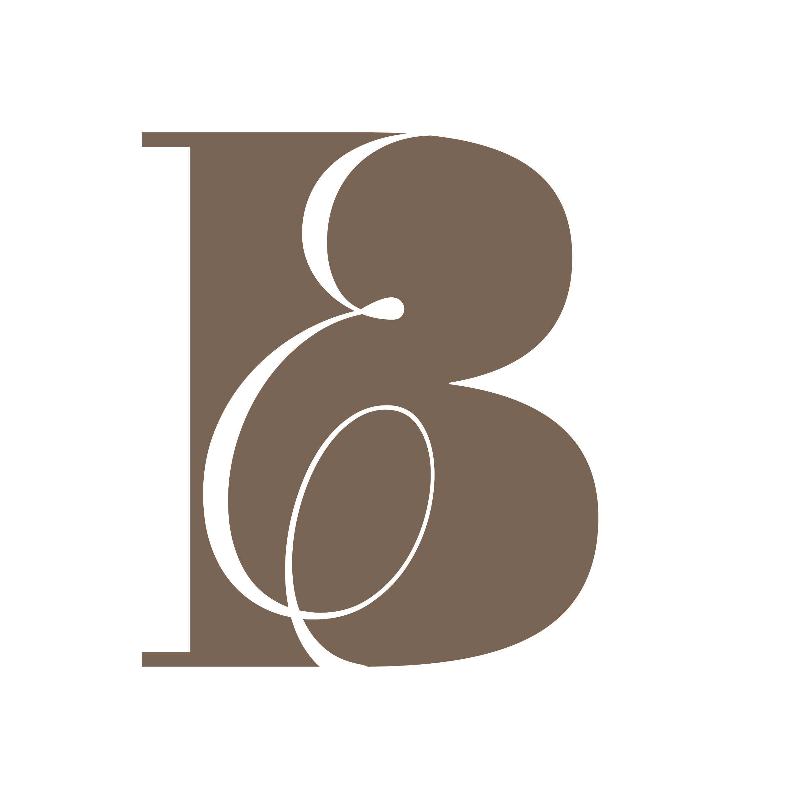
Consider incorporating symbols like an balanced rock, yin and yang, or abstract forms representing connection and support.
Consider incorporating symbols like an balanced rock, yin and yang, or abstract forms representing connection and support.
Nature-Inspired Elements
Rock's or balancing could symbolize growth, healing, and the calm environment Theresa provides.
Rock's or balancing could symbolize growth, healing, and the calm environment Theresa provides.
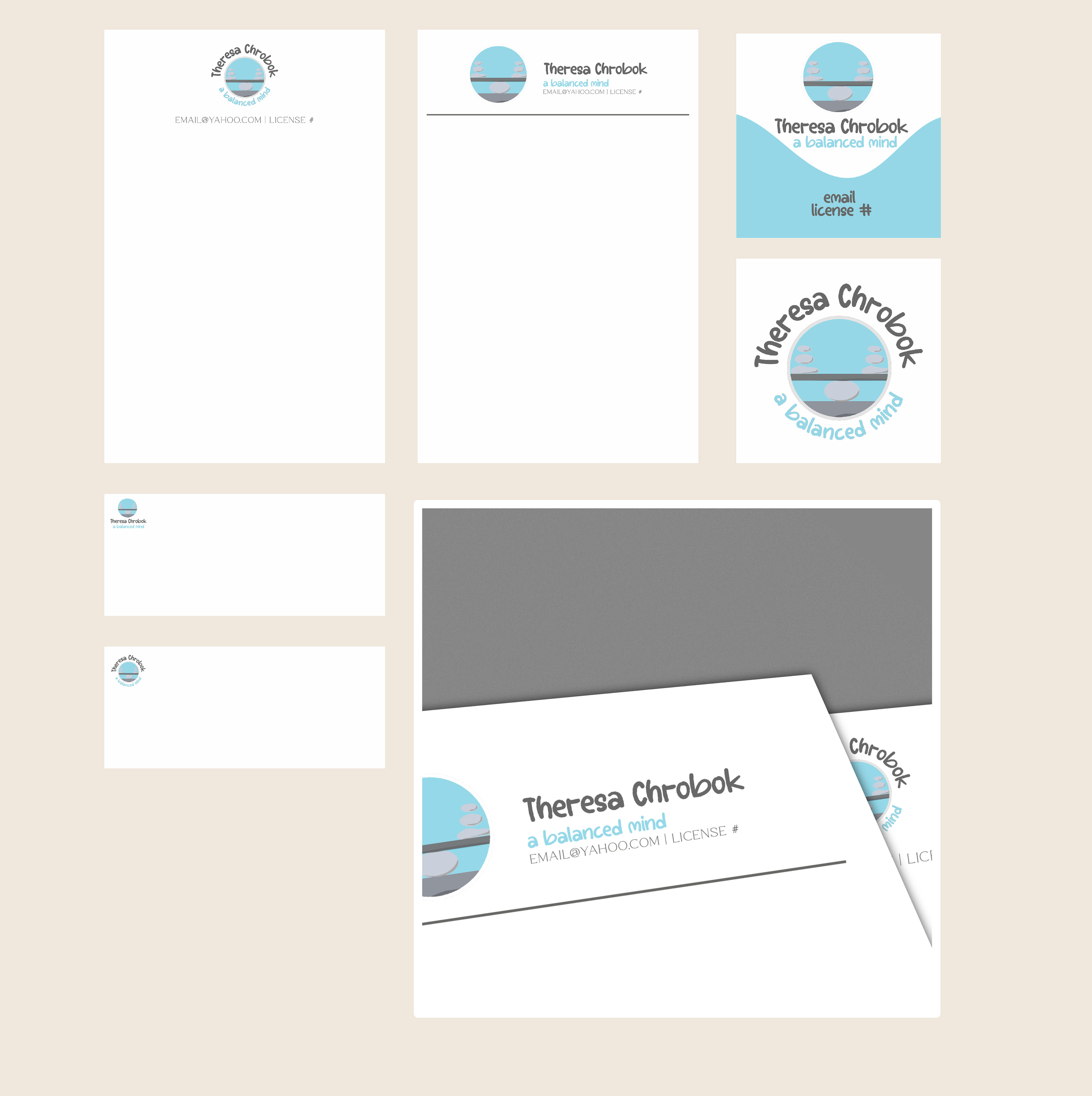

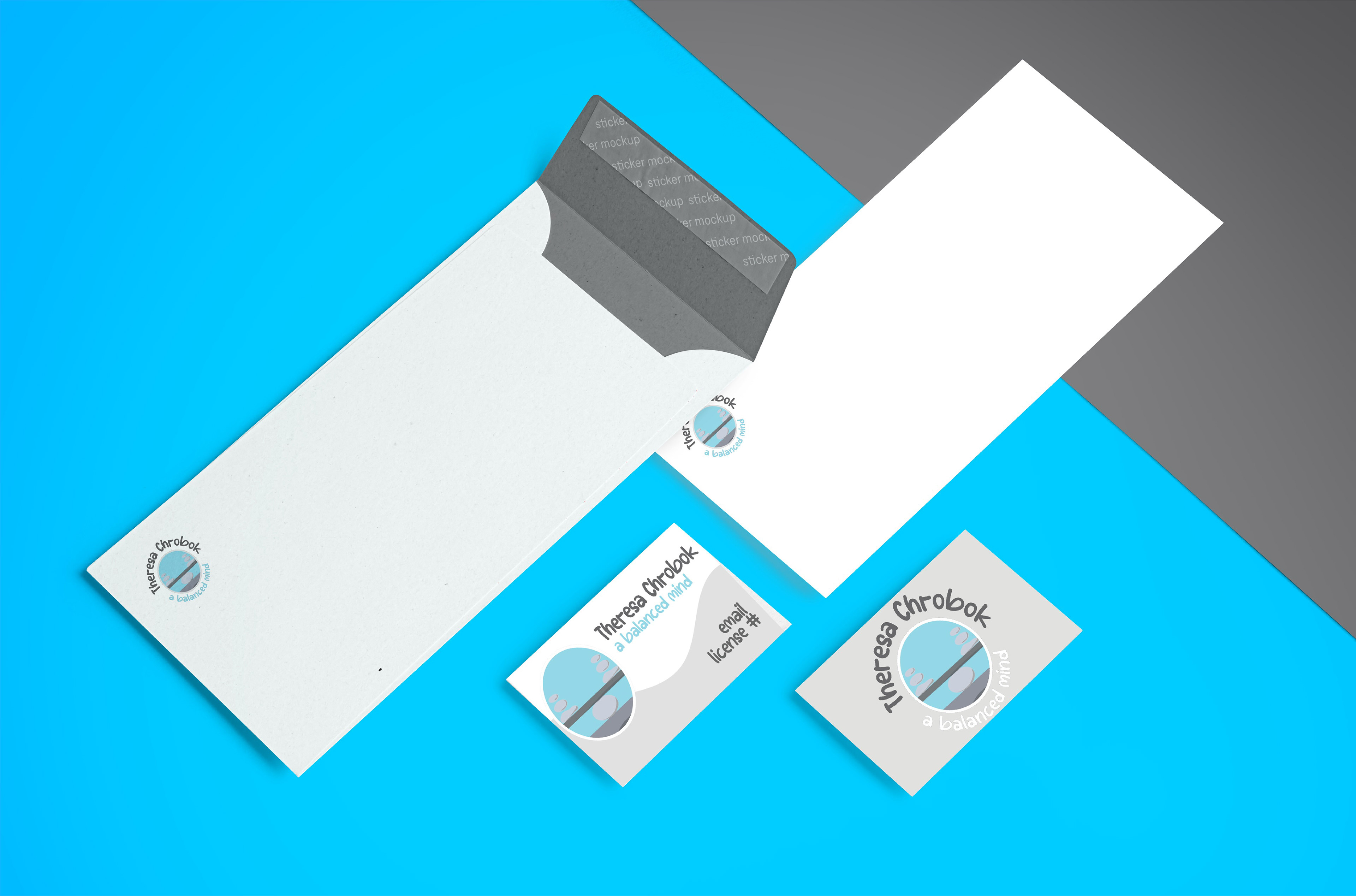
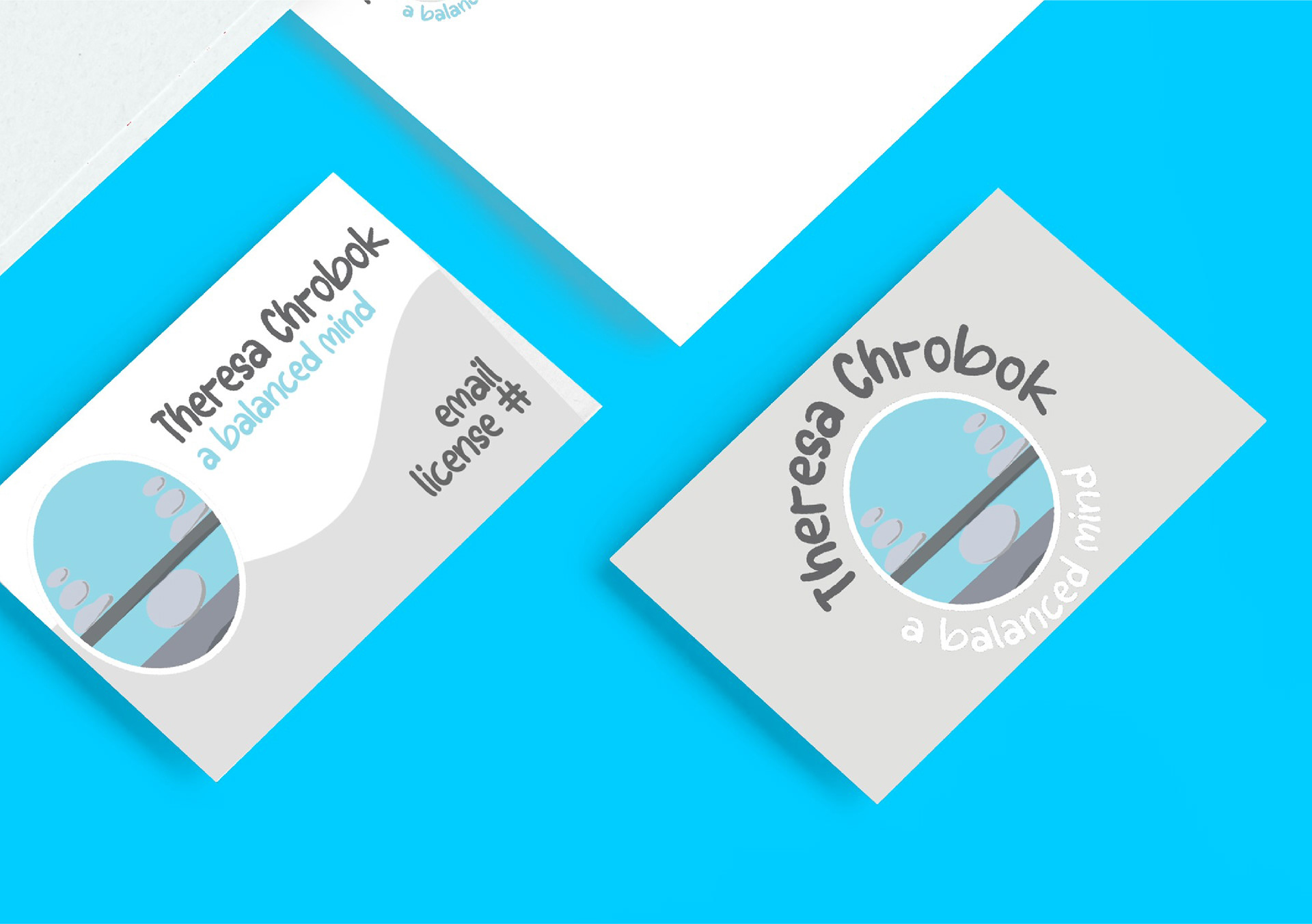
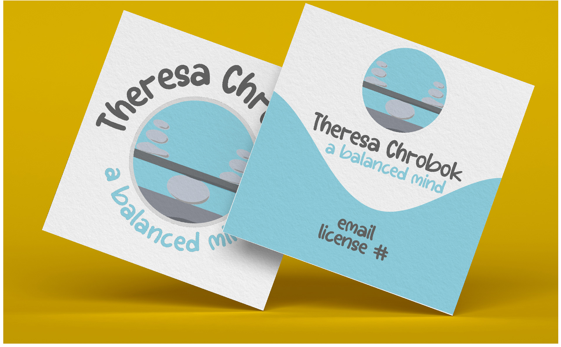
Business Cards
Front: Theresa Chrobok’s name, title, and contact information. Incorporate the logo and consistent color scheme. Back: A calming design element, such as a soft wave or leaf motif, with a tagline or short message that reflects Theresa’s approach (e.g., "Empathy, Connection, Compassion").
Letterhead
Header: The logo and practice name at the top, with contact information (address, phone number, email, website). Footer: A subtle design element or pattern that echoes the logo’s symbolism, ensuring it doesn’t overwhelm the content.
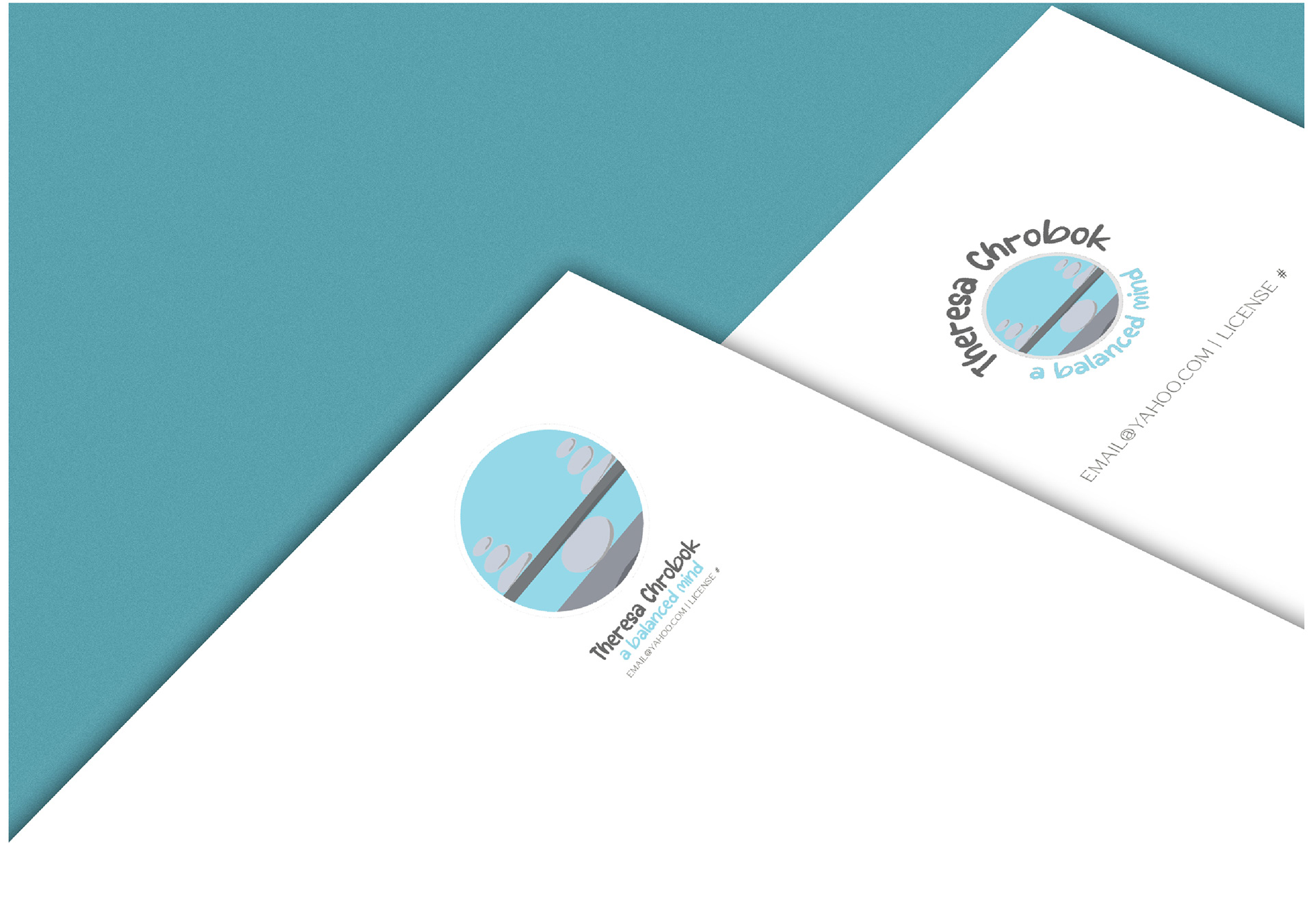
Envelopes
Front: Logo and return address in the top left corner. Simple and clean design, with the option to include a small design element (e.g., a soft wave or abstract symbol) on the back flap. Back: Consistent with the color palette and design theme, ensuring a cohesive look when paired with the letterhead.
Appointment Cards
Front: Theresa’s name, title, logo, and contact information. Back: Space for writing appointment details, with a calming background or border design that reflects the overall aesthetic.
Notepads
Header: Logo and practice name at the top, with a clean, spacious area for writing. Footer: Subtle design element or pattern, consistent with the other stationery items.